Video Guide
Start with the video for a quick overview, then follow the written steps below.
Overview
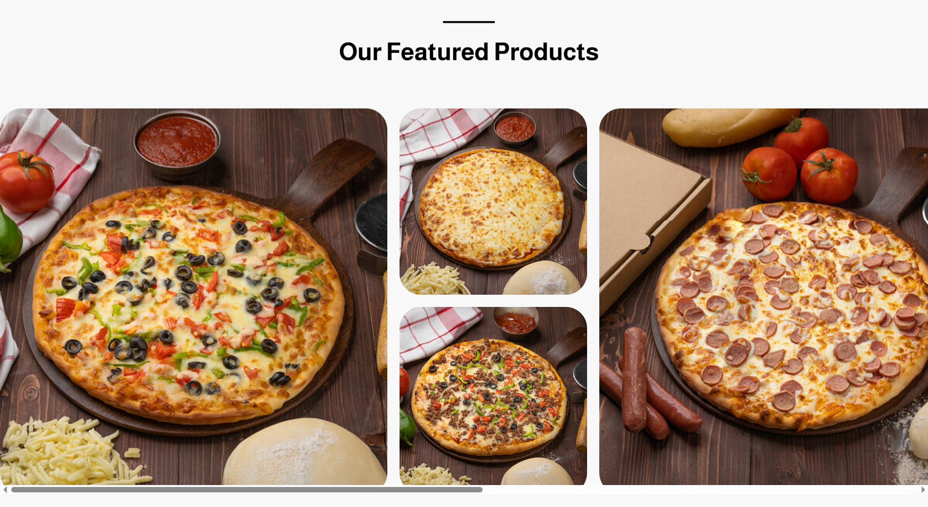
The store landing page is a specialized interface designed to provide a comprehensive overview of the store’s strengths, offers, and services. This page combines essential information, images, and interactive options to enhance the visitor’s experience and build customer trust. It serves as a powerful marketing tool that highlights the brand identity and attracts attention in a professional manner, with a responsive design that appears differently on desktop screens while displaying vertically on mobile devices.
How to Access the Home Page
- Log in to your store’s dashboard on Cartley .
- On the left side of the screen, locate the " Store Landing Page " section.
- A dropdown list will appear; select Home.
- Click the "Add" button located at the top-right of the page.
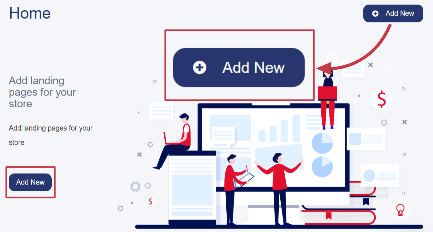
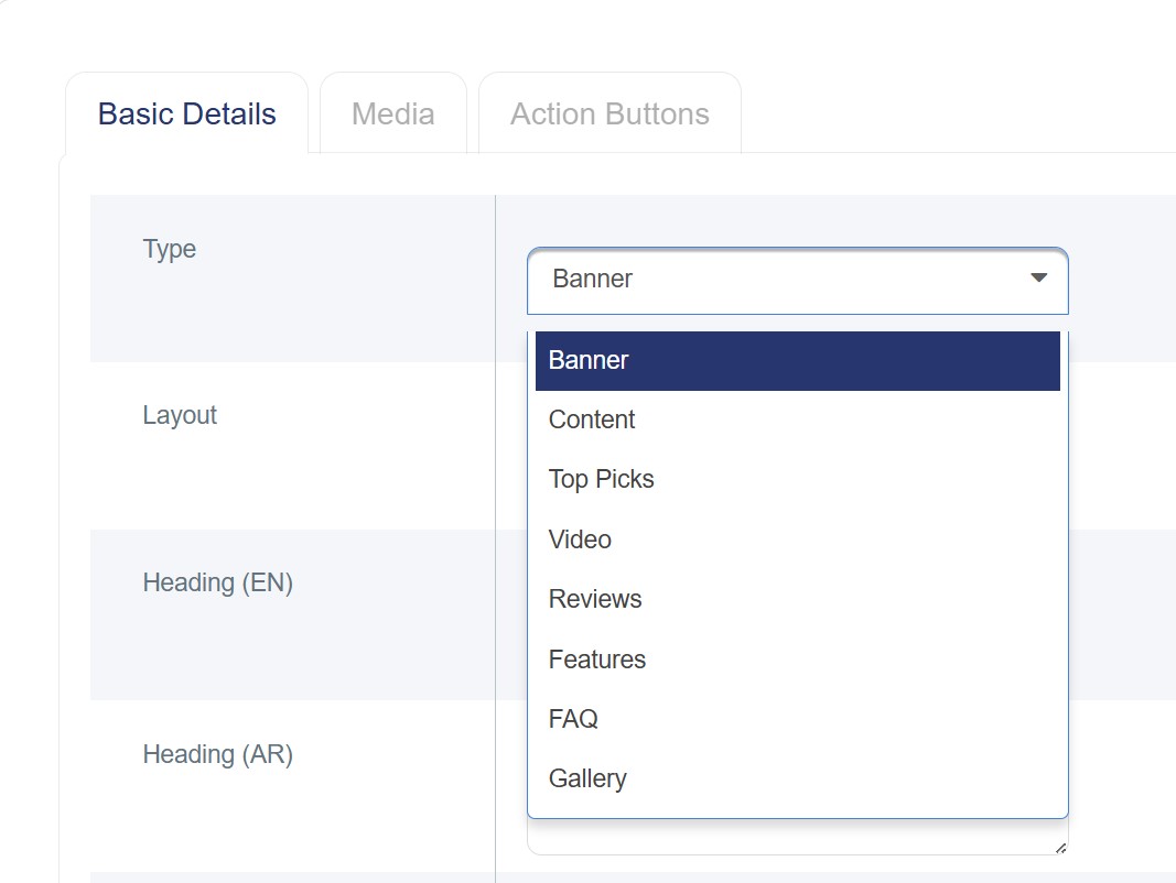
- A new window or page will open containing a form to enter details, which includes:
Types of Main Home Page Content
1. Banner
2. Content
3. Top Picks
4. Video
5. Reviews
6. Features
7. Frequently Asked Questions (FAQs)
8. Gallery
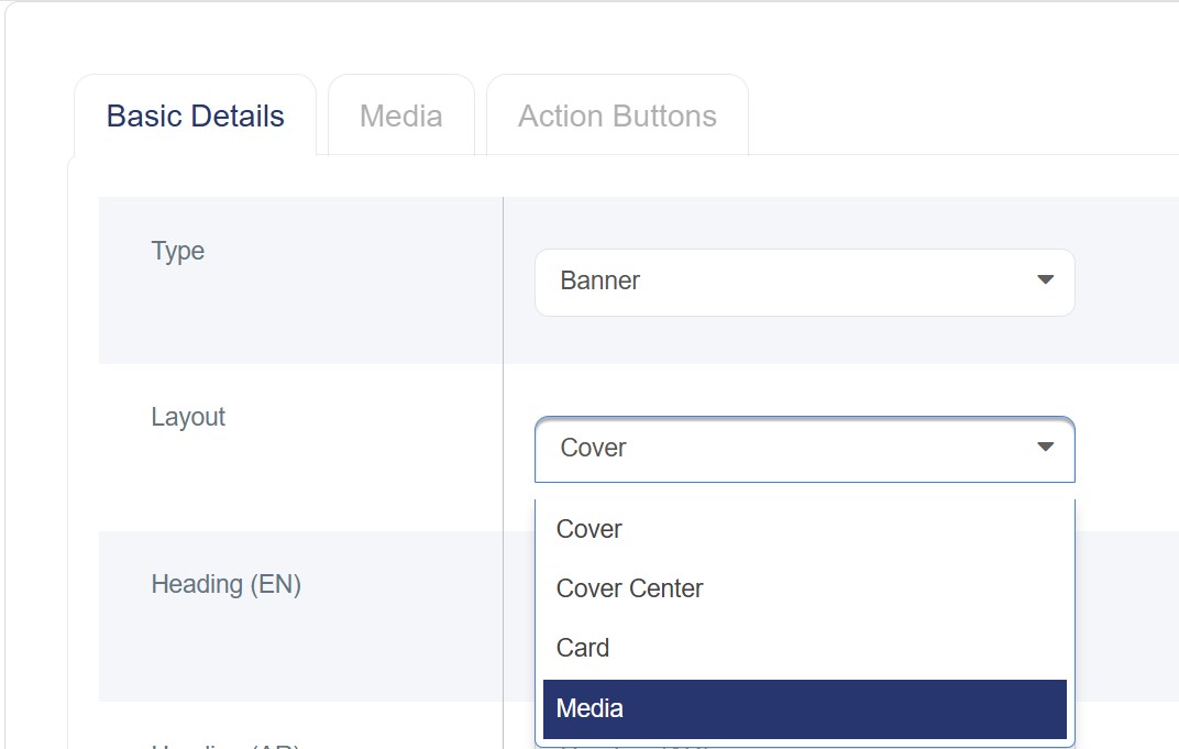
Banner
It is a (JPG) image or an (MP4) video used as a welcoming message for customers, providing an overview of the store while highlighting its identity and featured offers. It serves as a visually appealing element that captures visitors’ attention from the first moment and encourages them to explore the store and engage with its content. It can be added to the main interface to enhance the overall visual appeal and includes multiple types:
· Cover: The cover is displayed as an image (1920×1080) or a high-resolution video spanning the full width of the screen, with a title in both (English) and a description of no more than 500 characters. It creates a strong visual impression that captures the visitor’s attention from the first moment. It is recommended to choose an image or video from the media library that accurately reflects the brand identity or the services offered.

· Cover Center: This is the central area or text box that appears over the cover image on the online store. It contains the main texts and marketing messages you want to convey.

· Card: Displayed as a balanced design combining a nearly square image or video on one side of the screen, while the other side contains the text or marketing message of the store.

· Media: Images or video clips displayed on the interface without text, intended to highlight the store’s identity and attract the visitor’s attention in a simple and appealing way.
§ Sort: Arrange the interface types according to the desired layout on the store’s Landing page
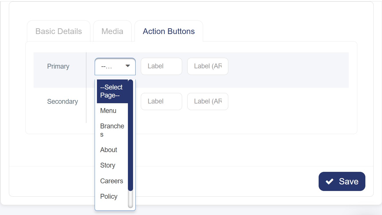
§ Action Buttons: You may find extra fields that appear only when selecting (Cover, Cover Center, or Card). These fields are divided into primary and secondary types and help enable additional or transitional features after selecting the page type:
o Menu: Redirects to the main product menu.
o Branches: Leads to the page displaying the store’s various branches.
o About: Opens the “About Us” page.
o Story: Takes the user to the store’s story or background page.
o Careers Page: Redirects to the careers section, if available.
o Policy: Displays the store’s policies, such as the privacy policy or return policy.
o Custom Page: When selecting this option, an additional field will appear allowing you to enter the link of the page you want to redirect to when clicking the button. Please copy the part of the link that appears after “/” from the selected page’s URL.
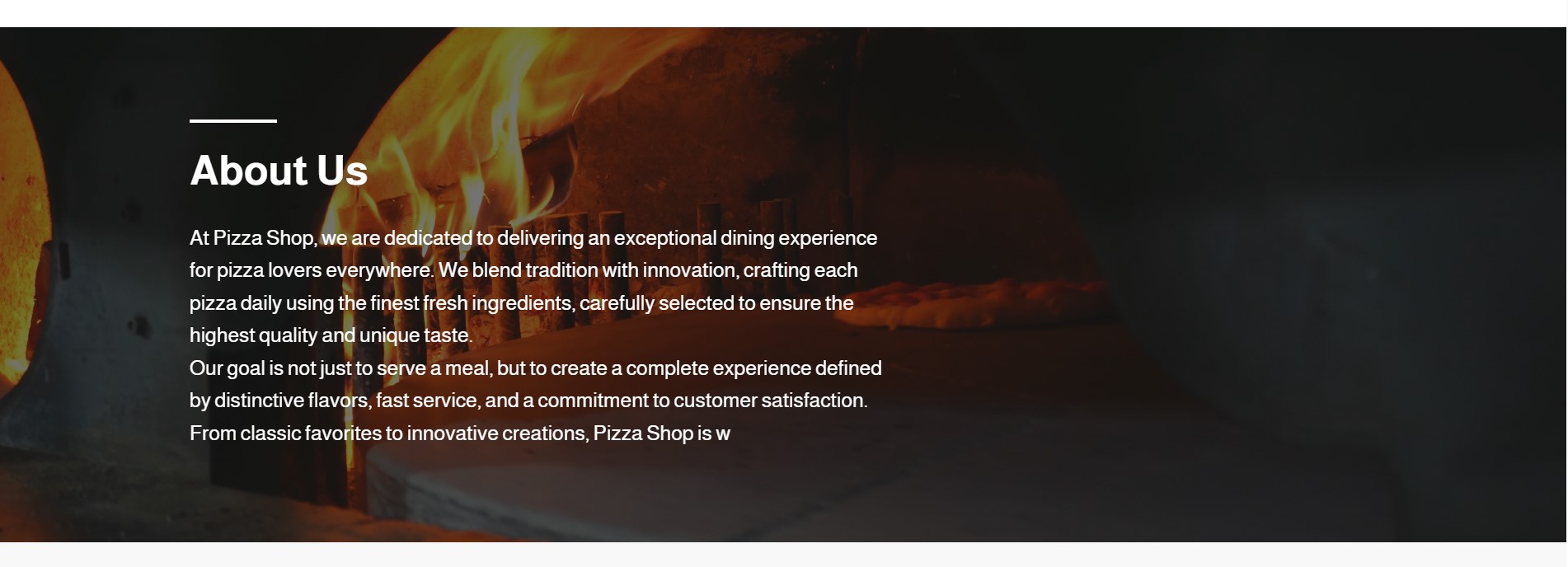
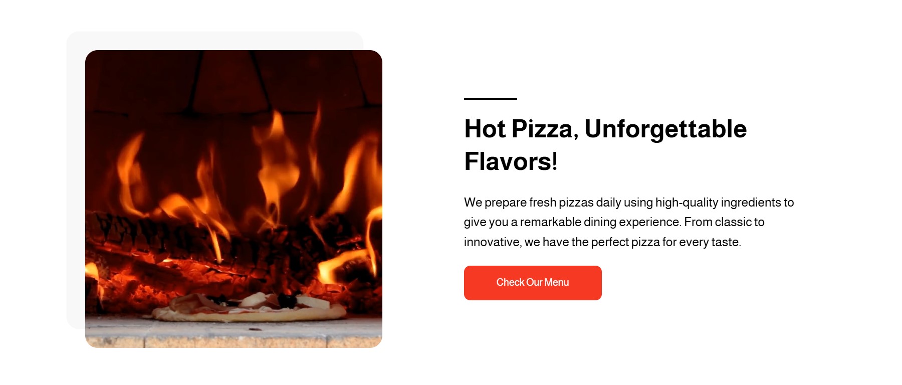
Content
This section provides an overview of the store, a product, or a service, aiming to clearly and simply introduce visitors to what the store offers. It can be displayed in two ways:
1. Cover: Displays a high-quality image or video related to specific content, spanning the full width of the screen but slightly smaller in size than the Banner. It includes a bilingual title ( English) and a description of up to 500 characters, highlighting the content attractively without affecting the visual balance of the page.
2. Card: It is a design that combines an image or video in a square format on one side of the screen, with the option to choose the direction (right or left). It is used to display short and engaging content in a clear and organized manner.
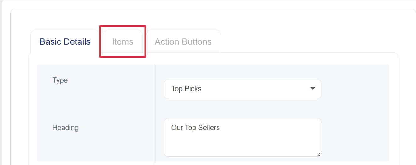
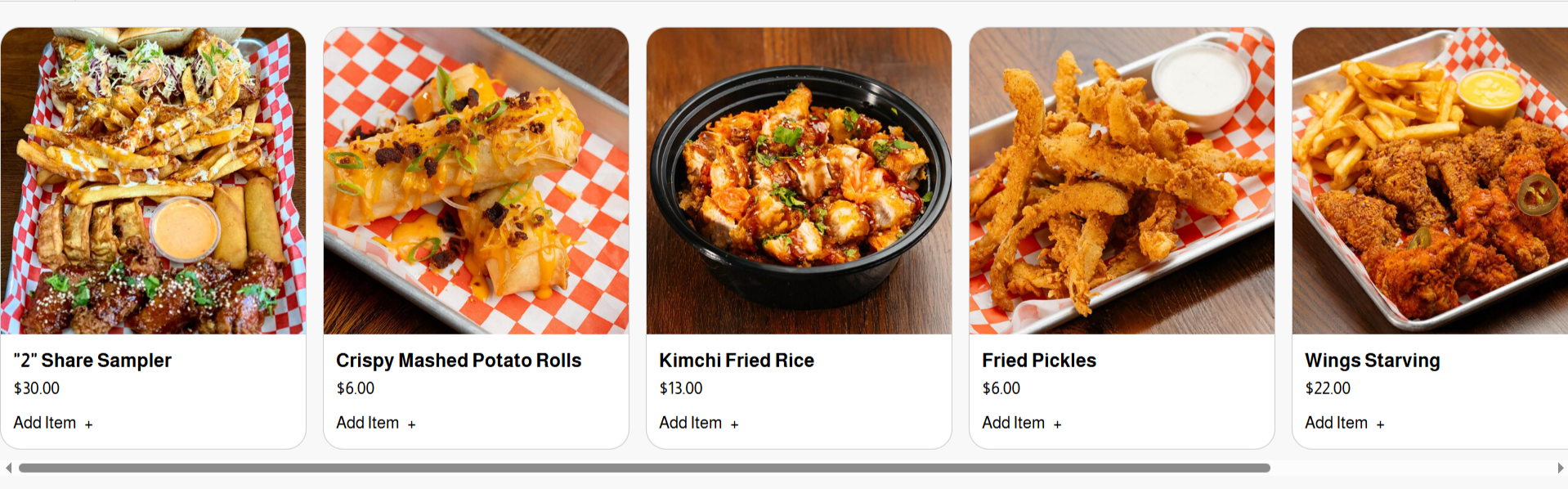
Top Picks
A dedicated section for showcasing the most popular, best-selling, or store-recommended products. It is displayed as adjacent cards, each containing the (product image, name, price, and an “Add to Cart” option)
When selecting the “Top Picks” type, a side panel will appear next to the basic details under the name “Items”, allowing you to search for and select which products will be displayed on the Home page
Video
The video used in the store’s front interface must be in MP4 format only. It is considered an essential element due to its many advantages, including:
§ Quickly Captures Attention:
A video grabs the visitor’s attention faster than text or static images.
§ Showcases Products Realistically:
Visitors can see the products in actual use, providing a clearer view of their quality.
§ Delivers Messages Faster:
A video can convey an idea or promotional offer within seconds, unlike lengthy text descriptions.
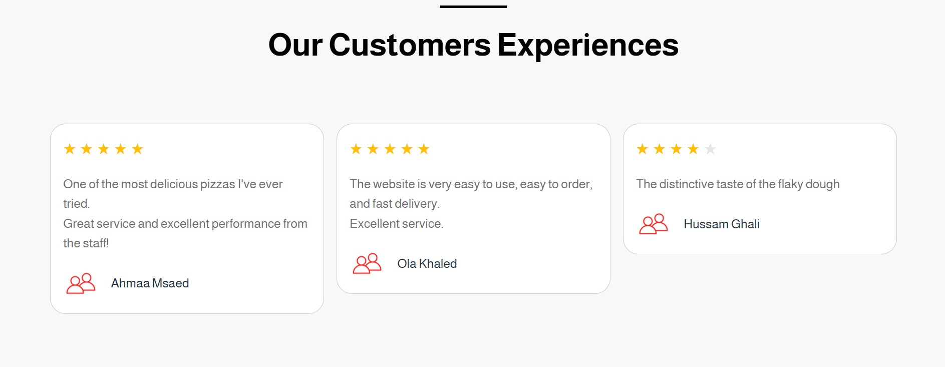
Reviews
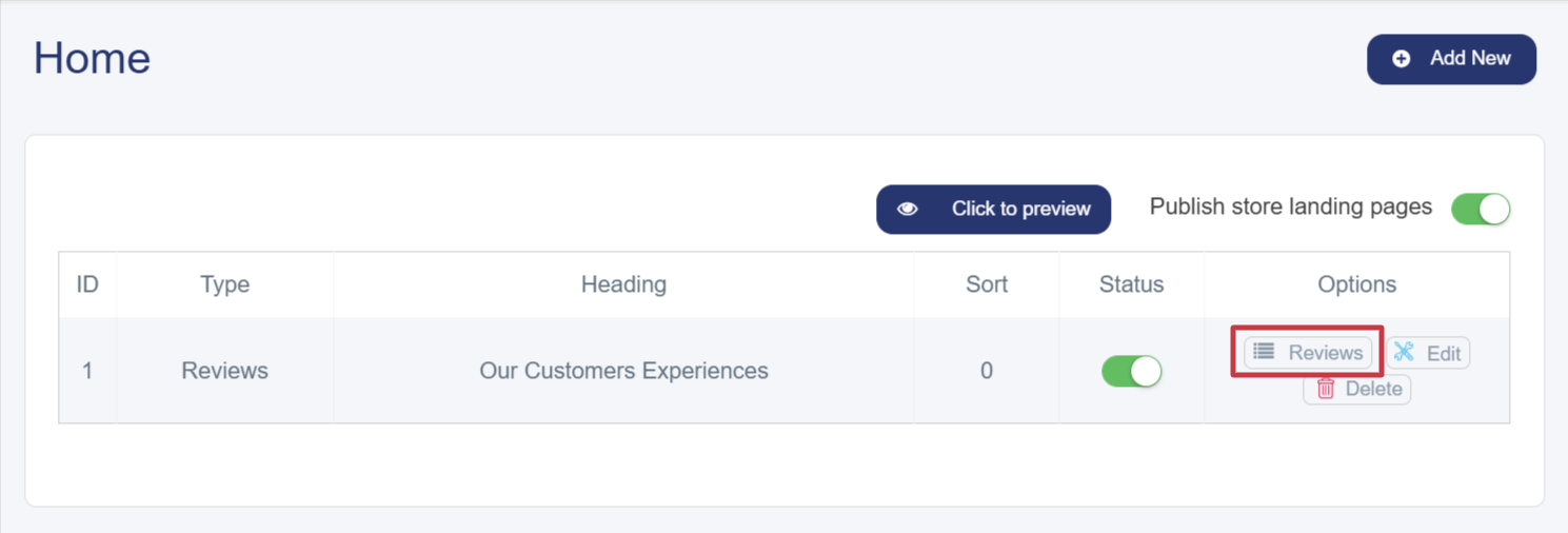
These represent customer opinions and experiences with the store’s products or services. They are typically displayed using a star rating system (from 1 to 5 stars) along with a short comment describing their experience. Reviews can be added only once to the main interface by following these steps:
1. Click the “Add New” button at the top right of the Home page.
2. A new window or page will appear containing a form to enter the details.
3. Select the interface type (Reviews).
4. Add a bilingual title ( English) and a description of up to 500 characters.
5. After saving, the Reviews button will appear on the main page under the Options column, next to the Edit and Delete buttons, allowing you to manage customer reviews easily and efficiently.
6. A window will appear for adding customer reviews containing the following elements:
§ Customer Image: 500 × 500 pixels.
§ Name: In English, with a brief description of their opinion about the store’s products or services.
§ Stars: Indicates the customer’s level of satisfaction.
§ Sort & Activation: Choose the display order of the review, then activate it (in green) to display it on the main interface.
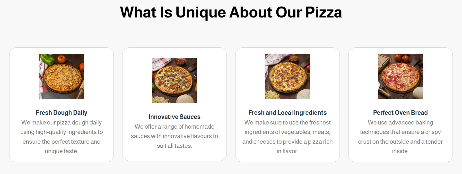
Features
These are the characteristics, benefits, and services that the store offers its customers, distinguishing it from competitors — such as fast order processing, multiple payment methods, and quick delivery. They are displayed as adjacent cards and can be added by following these steps:
1. Click the “Add New” button at the top right of the Home page.
2. A new window or page will appear containing a form to enter the details.
3. Select the interface type (Features).
4. Add a title (English) and a description of up to 500 characters.
5. After saving, the Features button will appear on the main page under the Options column
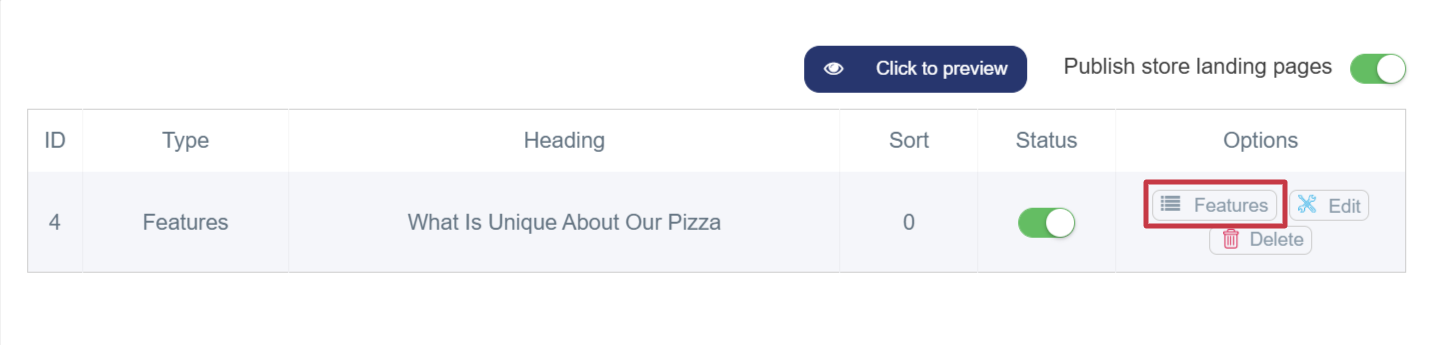
6. A window will appear for adding features containing the following elements:
§ Feature Image: A 500 × 500-pixel image representing a specific product or service.
§ Feature Name: In English, with a brief description.
§ Feature Sort & Activation: Choose the display order, then activate it (in green) to display the feature on the main interface.
Frequently Asked Questions (FAQs)
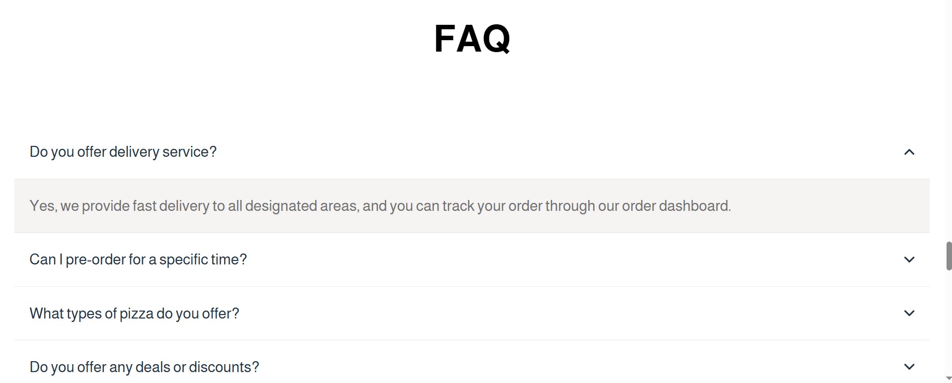
A collection of questions that customers or visitors commonly ask about the product or service, each paired with a clear answer. The purpose is to save time, provide quick information, and reduce the need for direct customer support. FAQs can be added only once to the main interface by following these steps:
1. Click the “Add New” button at the top right of the main interface page.
2. A new window or page will appear containing a form to enter the details.
3. Select the interface type (FAQs).
4. Add a title (English) and a description of up to 500 characters.
5. After saving, the FAQs button will appear on the main page under the Options column.
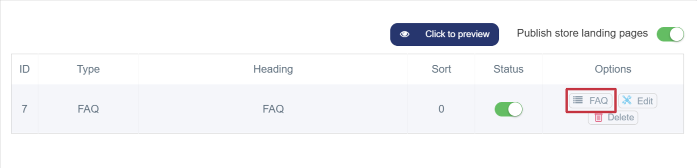
6. A window will appear for adding FAQs containing the following elements:
§ Question: Must be added in English.
§ Answer: Refers to the response to the frequently asked question. It should be concise and clear, not exceeding 500 characters, to provide quick and useful information to the customer.
7. After saving, the questions will be displayed in an organized list format — one question per row. When clicked, the answer expands below the question to reveal the details.
Gallery
The image gallery is an attractive section in the online store that displays the store’s products or services through clear and well-arranged images, encouraging visitors to browse and explore more. You can add up to 10 images per gallery, helping capture customer attention, increase engagement with products, and boost purchase opportunities.