Analytics
The Analytics page on Cartley serves as the central dashboard that consolidates all key metrics and in-depth analyses of your online store in one place. It is essential because it provides a comprehensive view of your store’s performance and helps in making strategic decisions.
You can access it by following these steps:
1. Log in to your store’s dashboard on Cartley.
2. From the main menu, select “Reports.”
3. A drop-down list will appear — choose “Analytics” to view detailed statistical data, which includes:
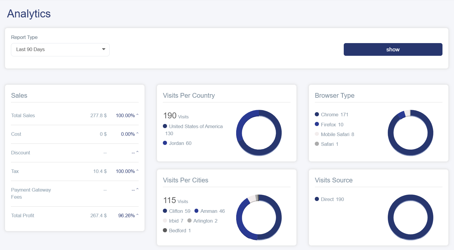
· Control Tools / Report Type: A dropdown menu that allows you to select the time period:
· Today: Statistics for the current day only
· Week: Last 7 days
· Month: Last 30 days
· Year: Last 12 months
· Custom Period: Select your own dates
Then click the “show” button to display the details in the following sections:
Sales Cards
1. Sales
A detailed list showing:
· Total Sales: Shows the overall value of all sales along with a percentage
· Cost: Displays the total cost of products sold
· Discount: Total discounts granted to customers
· Tax: Collected taxes
· Payment Gateway Fees: Fees for electronic payment processing
· Net Profit: (Net Profit = Sales – Cost – Discounts – Fees)
2. Visits by Country
This card displays:
· Title: “Visits by Country”
· Number of visits
· Distribution of visitors by country
Benefit: Understand the geographical markets most interested in your products.
3. Visits by City Provides a more detailed distribution within the same country.
Benefit: Enables targeting local marketing campaigns to the most active cities.
4. Browser Type: Shows which browsers visitors use (Chrome, Safari, Firefox, etc.)
Benefit: Ensure your store is compatible with the most commonly used browsers.
5. Visits Source: Shows where visitors come from (Google, Facebook, Instagram, Direct).
Charts and Analytics
display:
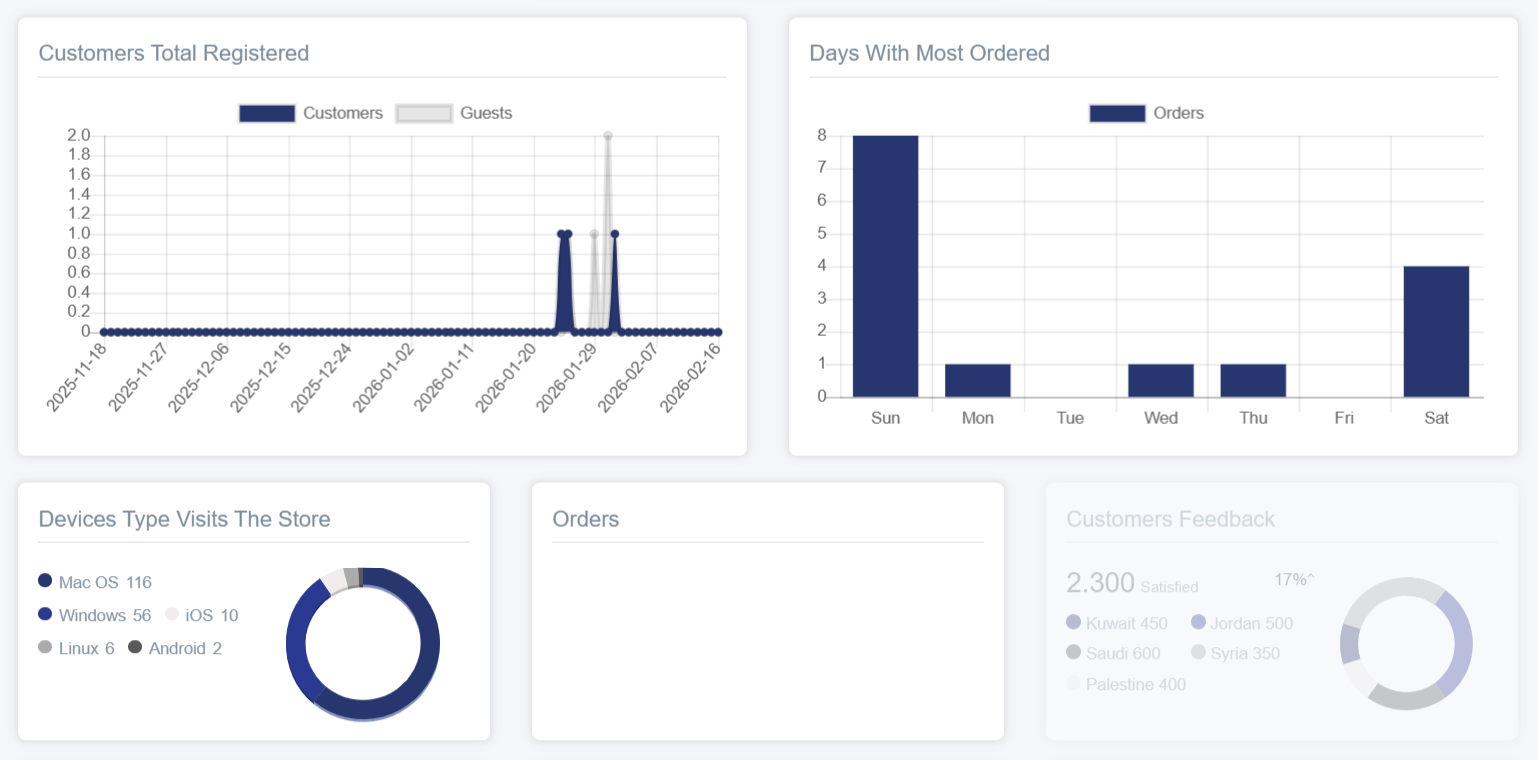
1. Customers Total Registered: A line chart showing:
· Horizontal Axis: Time based on the report type selected in the control tools
· Vertical Axis: Number of customers (0 to 1.0)
· Two lines:
§ Gray: Visitors
§ Blue: Store customers
This helps identify peak customer registration times, compare visitors to actual customers, and understand the conversion rate from visitor to customer.
2. Days With Most Orders: A vertical bar chart showing:
§ Horizontal Axis: Days of the week (Saturday, Friday, Thursday, Wednesday, Tuesday, Monday, Sunday)
§ Vertical Axis: Number of orders (0 to 1.0)
§ Blue Bar: Orders
Benefit: Identify the busiest sales days, plan promotional campaigns, and organize staff schedules and inventory.
3. Device Type Visits The Store: A pie chart showing visits by device (Windows, Mac, etc.).
4. Orders: A simple card showing the total number of orders.
5. Customer Feedback: A pie chart showing the number of satisfied customers along with their geographic distribution, providing a clear view of customer satisfaction and concentration areas.
6. Repeat Customer Average: Shows the percentage of customers who buy only once versus those who return for additional purchases.
7. Daily Hours Most Orders: Identifies peak hours of activity throughout the day.
8. Delivery VS Pickup: Displays total orders that were delivered or picked up from the branch.
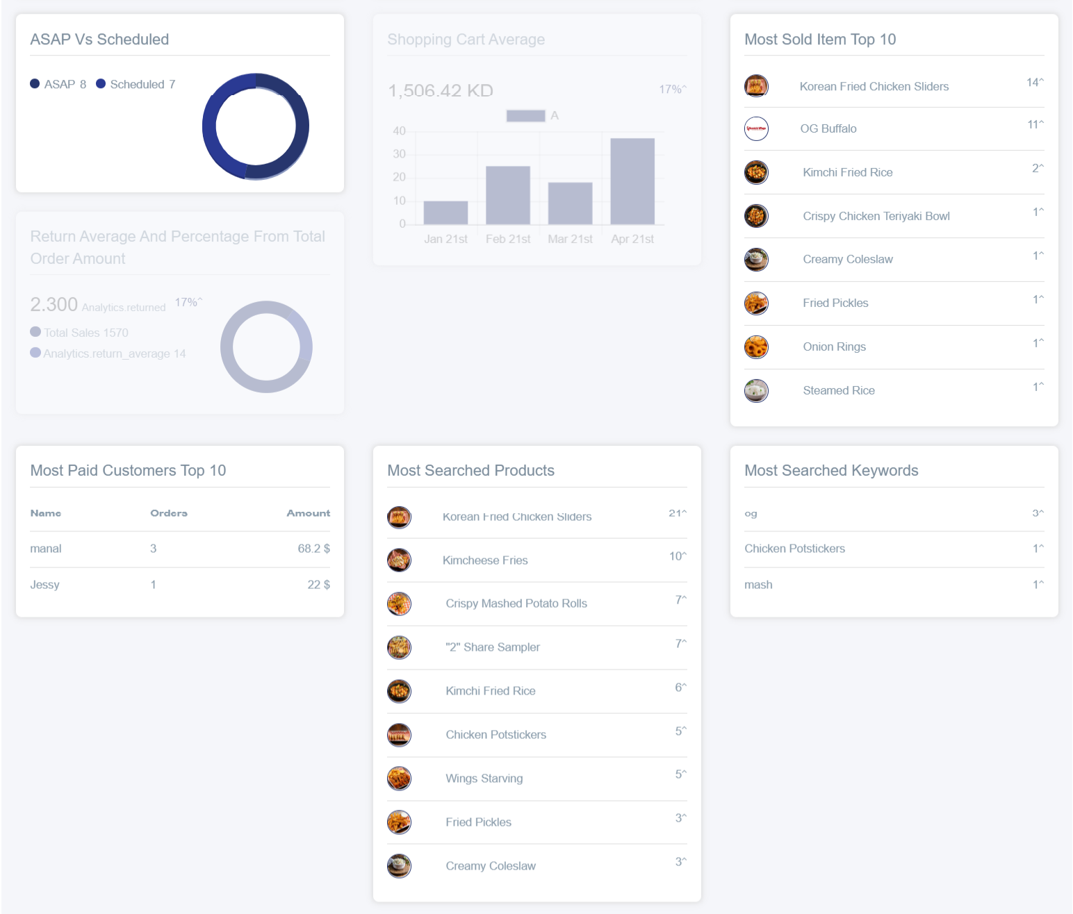
9. ASAP VS Scheduled Orders: Shows orders delivered urgently versus those scheduled for a later time.
10. Shopping Cart Average: A vertical chart providing an accurate view of the average basket value over specific time periods, helping measure sales performance and strategic planning.
11. Most Sold Item: Shows a list of best-selling products, helping merchants identify popular items and make inventory and promotional decisions.
12. Most Paid Customers: Lists key customers with the highest purchase volumes, including quantity and order details, enabling merchants to reward loyal customers and enhance retention.
13. Most Searched Products and Keywords: Allows merchants to track the most searched products and keywords, helping optimize marketing strategies and attract targeted customers.